A logo design company must go through all the attributes of minimalism before designing a minimalist logo. On searching define minimalism on Google, Merriam Webster defines minimalism as a style or technique characterized by extreme spareness and simplicity. It uses existing elements and capitalizes on space. This technique is laid across many mediums, from arts to literature.
The minimalism method subscribes to less is more as well as effortlessness, due to which it feels empty and boring. On the contrary, it is impossible to deny the serenity and simple beauty squared up with a resolved minimalist logo design. But achieving this design is deliberate and complex, leaving the design to feel cold and sparse.
Also checkout: How to merge idea with your logo?
Difference Between Simplicity and Minimalism
Are simplicity and minimalism different? On the contrary, they both have scores of common traits that can be easily jammed into the same category.
Simplicity focuses on an uncomplicated and uncompounded way of design, and minimalism focuses on cutting down the number of possessions to the bare minimum possible to create a maximum effect in the design.
For a logo design company, simplicity vs minimalism is a dangerous way to go. However, to design an aesthetic and meaningful emblem, the way to go is simplicity combined with minimalism. Therefore, it’s of high priority not to get caught with labels but to benefit from both.
Rebranding Towards Minimalism
In the early 1900s, during the infancy of modern business, the fight for customers picked up, and companies put their brainpower for customer recognition and branding. Before that, for a logo design company, logos were nothing more than the name of a business in the popular font of the time use to communicate the company’s name to the people.
To keep up with modern times, many companies redefined their logos with a minimal approach. In the process, many companies adopted heavy and clunky designs.
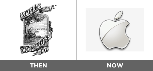
Apple company is the best example of the rock that stood still through the various changing seasons of the design industry. The company was strategic about modernizing remaining true to its roots while rebranding.
Logos and Minimalism
Logos are the essential and defining part of the brand’s identity. They assist people in recognizing the products of your brands just by looking at the logo. Therefore, it needs to be well thought of and relevant to the personality of the brand. With the advent of modernization in business, many companies moved towards minimalism in their logo design without changing the core meaning and values of the company.
Apart from the fact that they need to stay congruent with the latest market design, the new logo mapped out by the company must be introduced by the brand across all the platforms. It is the best way to increase familiarity among the people and answer all the questions that you think will arise in the customers’ brain to solve all the puzzles they could have.
Tips for Minimalist Logo Designs
Following are the minimalist logo design ideas:
Geometric Modern Logos
The only purpose of a logo is to communicate with the clients in a comprehensive yet straightforward way possible. The fundamental shapes of geometry communicate the essential qualities of a brand in the most immediate way possible.
Different sentiments are associated with geometric shapes. Let’s take into account the example of a circle, ovals, and ellipses. They project the feelings of love, friendship, and community. So, focus on using them for organizations with similar attributes.
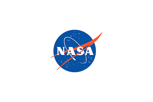
Geometrical shapes are flexible; you can either create a simple or intricate design by combining shapes or blend in some bold color palette to give an overall bold look. The logo of the national geographic and NASA are outstanding examples of geometrical logos.
Typographic Logos
Using typography to represent your brand through a single letter, an acronym, or the brand’s full name is a modern take on the logo and ensures it is recognizable to the public. Even without a graphic element added, a unique logo will immediately stick out with the right typography and color palette.
Since typography is the only element in the logo, so make sure the font you use is readable, and people know what company they’re dealing with. If design is not looking interesting or humdrum, jazz it up with some unexpected color palette.
Optical Illusion Logos
The optical illusion is the best to cast if you want to enchant your clients with a pausing spell. These designs use elements to trick the eyes, 3D effect, or an illusion of depth or movement.
Don’t visually overwhelm your audience by going too big with optical illusion. Instead, make sure the logo is not only tricky to the eyes but also pleasing. To make the optical illusion the focal point of your design, keep the rest of the elements simple and let your optical illusion take the spotlight.
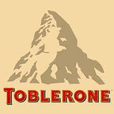
Look closely at the Toblerone wrapper. Have you noticed the bear there?
Hope you like this content if yes then checkout our other categories too.
Was this helpful?
1 / 0